ARCHIVE
CodeQuotient Blog
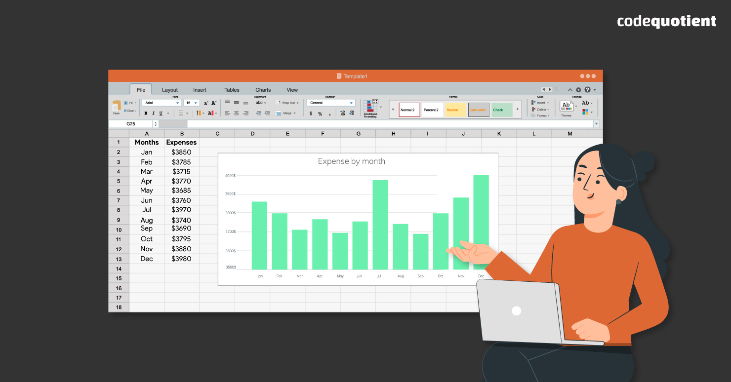
Data Visualisation in Excel: 6 Tricks for Compelling Charts and Graphs
Data visualisation in Excel transforms data into visual forms, such as charts, graphs, maps, or diagrams. It is a powerful way to present data in an effective and engaging way, as it can help you communicate your message, reveal patterns…