Data visualisation in Excel transforms data into visual forms, such as charts, graphs, maps, or diagrams. It is a powerful way to present data in an effective and engaging way, as it can help you communicate your message, reveal patterns and trends, and persuade your audience.
One of the most popular and versatile tools for data visualisation is Excel. Excel is a spreadsheet application that allows you to store, manipulate, and analyse data in various ways. It also has a rich set of features and functions that enable you to create stunning and interactive charts and graphs from your data.
In this article, we will share with you six tricks for data visualisation in Excel that will help you create compelling charts and graphs that will impress your audience.
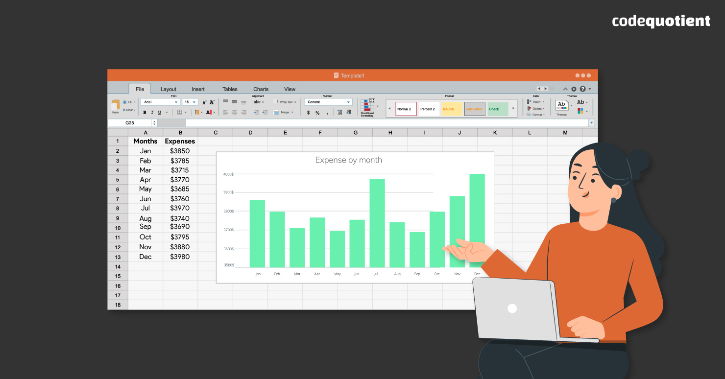
Trick 1: Choose the Right Chart Type for Your Data
Selecting the appropriate chart type in Excel is the first crucial step towards effective data visualisation in Excel. Different chart types convey distinct messages and insights from the same dataset.
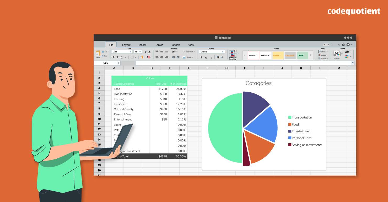
For instance, line charts excellently depict trends in time series data, while bar charts are perfect for comparing categorical data, and pie charts effectively represent proportions.
To avoid creating misleading or confusing charts, avoid gimmicky 3D effects that can distort data perception. Ensure your scales and axes are appropriately labelled and scaled, preventing misinterpretation.
Trick 2: Customising Chart and Graph Design in Excel
Customising the design of your charts and graphs as part of your data visualisation in Excel is a vital step in makingthem truly impactful. By paying attention to details like colours, fonts, shapes, and other elements, you can significantly enhance their appearance and readability. You can also use the Format Task Pane (Ctrl + 1) to see all the options in one place.
For example, choosing the right colour scheme can evoke specific emotions or highlight critical information. Adding titles and labels ensures clarity while adjusting gridlines and borders helps guide the viewer’s eye.
To excel in data visualisation in Excel, remember to employ principles like contrast to make important data stand out, alignment to maintain a clean layout, consistency for a unified look, and simplicity to prevent overwhelming your audience.
Trick 3: Add Interactivity to Your Charts and Graphs
Adding interactivity to your charts and graphs in Excel can transform static visuals into dynamic, engaging tools for your audience. Interactive elements allow users to actively explore the data actively, enhancing their understanding and engagement.
For example, you can employ filters to enable users to view specific data subsets selectively. Slicers offer a user-friendly way to filter data, and buttons can trigger actions like data refresh or chart updates. Macros can automate complex tasks, such as animating charts or updating data sources.
However, when incorporating interactivity, it’s crucial to test and troubleshoot your creations thoroughly. Ensure that all features function as intended, considering compatibility with different Excel versions and assessing the performance impact of complex interactivity.
Trick 4: Harness the Power of Conditional Formatting in Excel
Conditional formatting is your secret weapon for making essential data stand out in charts and graphs. It’s like having a highlighter for your numbers. By applying specific formatting rules, you can effortlessly draw attention to critical insights within your visualisations.
For instance, in Excel, you can use conditional formatting to make values above a set threshold appear in vibrant green while values below turn striking red. This visual cue instantly communicates the significance of data points.
You can also employ icons or indicators to denote trends, such as arrows pointing up for positive growth or down for declines.
Trick 5: Combine Multiple Charts and Graphs into a Dashboard
Combining multiple charts and graphs into a dashboard in Excel is a strategic move to provide a comprehensive and coherent overview of your data. Imagine your data as a puzzle and the dashboard as the completed picture that brings it all together.
To create a dynamic dashboard, use features like sparklines (miniature charts), pivot tables (summary tables), and pivot charts (interactive charts).
For example, you can include sparklines to show trends within cells, pivot tables for summarising data, and pivot charts for interactive exploration.
When designing your dashboard layout as part of your data visualisation in Excel, prioritise a logical flow of information. Group related charts and graphs together, ensuring that the arrangement tells a clear data story. Place key insights prominently, and use titles and labels effectively to guide the viewer’s eye.
However, overusing conditional formatting can clutter your charts and confuse your audience. Keep it sleek and purposeful. Highlight only the most pertinent information to ensure your message comes across crystal clear.
Trick 6: Empower Your Data Analysis with Formulas and Functions in Excel
Formulas and functions are Excel’s dynamic duo, essential for data manipulation and analysis. These tools allow you to unleash the full potential of your data both before and after creating charts and graphs.
Formulas and functions in Excel enable you to perform a wide range of calculations. You can use arithmetic operators like addition (+), subtraction (-), multiplication (*), and division (/) to perform basic mathematical operations.
Statistical functions such as SUM, AVERAGE, and COUNT help you summarise and analyse data. Logical functions like IF, AND, and OR enable you to make decisions and filter data effectively.
To use these tools effectively during data visualisation in Excel, remember to employ parentheses to control the order of operations, ensuring accurate results. Absolute references ($A$1) lock cell references when copying formulas to other cells, preventing unintended changes.
Named ranges make formulas more readable by assigning meaningful names to cell ranges, enhancing your worksheet’s clarity and usability.
Take Your Data Visualisations to the Next Level
Data visualisation in Excel is a versatile and accessible way to transform data into meaningful insights. By following these six tricks, you can create compelling charts and graphs that not only inform but also captivate your audience.
Remember that practice makes perfect, so don’t hesitate to explore Excel’s features and experiment with different visualisation techniques.
If you’re looking to embark on a rewarding tech career and want to learn essential soft skills alongside industry-relevant tech skills, consider exploring Codeuotient Academy.
In our UGP-SE + BCA program, you can explore emerging technologies like Ajax, React, Node, Angular, MongoDB, and Java at CodeQuotient Software Labs. Gain hands-on experience, develop full-stack software applications and make your mark in the open-source community.
Contact us today to discover how we can help you embark on a successful journey in the tech world!